Typography
Typography involves the craft of designing a text – in print or on screen – so that the message is conveyed in the best possible way to the reader. This means that the text must be easy to read and aesthetically pleasing.
BentonSans
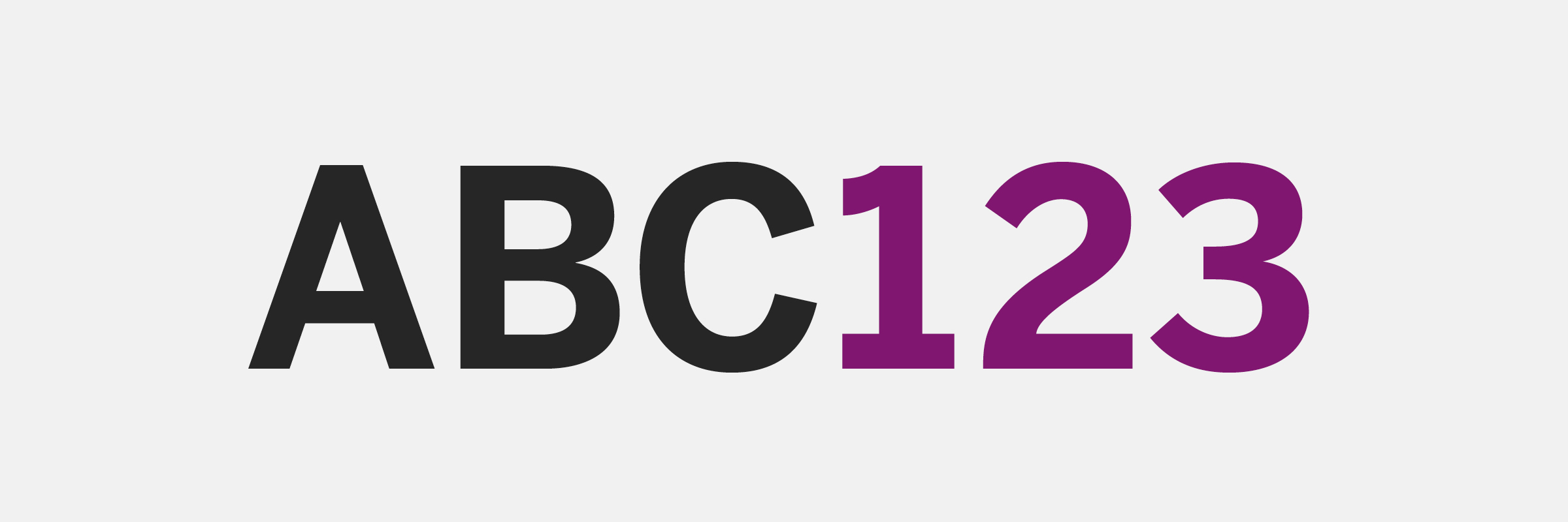
The main font used by JU is BentonSans, which has high readability both on screen and in print. Use the font primarily for:
- Headings
- Preambles
- Tables
- Shorter texts
- Everything to be read on screen
Scala OT
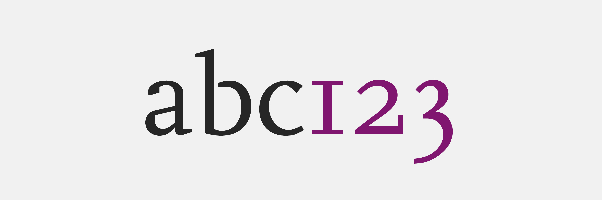
The font Scala OT is mainly used for longer body texts and information texts. Use the font primarily for:
- Running text (body text)
- Typographic “seasoning” in the form of capitals (capital letters of the same height)
Scala OT can be used as italic to mark and highlight certain passages of running text. Scala OT works best with a little extra space between the lines.
ScalaSans OT

The font ScalaSans OT is used sparingly and in the first instance for:
- Typographic variation